
Why Most Investor Websites Don’t Find Deals
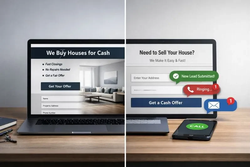
Most real estate investor websites look professional on the surface, but never actually produce deals. Clean layouts. Stock photos. Polished language. And somehow, the phone stays quiet.
That disconnect is exactly why people search for the best real estate investor websites. They’re not looking for design inspiration. They’re trying to figure out why some sites generate off-market opportunities while others exist purely as digital brochures.
The mistake most investors make is treating their website like a standalone solution instead of part of a larger system. A website doesn’t find deals on its own. It supports the process. When it’s built intentionally and paired with the right workflows, it becomes one of the most leverageable real estate investing tools pros use to find deals, not because of how it looks, but because of how it fits into the bigger picture.
That’s what this post is about.
This isn’t a design gallery or a list of trendy layouts. It’s a strategy breakdown of what the best investor websites do differently, why those choices work and how they quietly support consistent deal flow when used correctly.
The Common Mistake, Copying Design Instead of Deal Psychology
Most investors copy what looks good instead of what works. They borrow layouts from other investor sites, big brands, or coaching templates without understanding the psychology behind them.
The problem is that design doesn’t create motivation. Context does.
Sellers arrive with anxiety, uncertainty, and usually a deadline. A website built around branding instead of behavior fails to meet them where they are. It answers the wrong questions first. It explains the business before addressing the problem.
That’s why so many investor websites feel polished but powerless. They weren’t designed to guide a stressed homeowner toward a next step. They were designed to look “official.”
What This Post Is Actually About
This article is not a design gallery or a list of pretty websites. It’s a strategy breakdown.
We’re going to look at what the best real estate investor websites do differently at a structural and psychological level. How they communicate trust without overexplaining. How they reduce hesitation. And how they make taking action feel safe instead of risky.
If your goal is deal flow, not compliments, the difference matters.
By the end of this post, you’ll understand why most investor websites quietly fail, what actually causes sellers to reach out, and how to evaluate a site based on whether it’s built to find deals or just exist online.
What People Really Mean When They Search “Best Real Estate Investor Websites”

When someone searches for the best real estate investor websites, they’re not window-shopping. They’re trying to reduce uncertainty.
They want to know what actually works before they spend time, money, or energy building the wrong thing. Most of them already suspect their website isn’t pulling its weight, or they’re about to build one and don’t want to guess.
This search is about validation and direction, not aesthetics.
People want to see which investor websites consistently produce off-market deals, and more importantly, why. They’re looking for patterns they can recognize, understand, and apply without reinventing the wheel.
They’re Not Looking for Pretty Sites
Design is rarely the problem they’re trying to solve.
If visuals were enough, most investor websites would already be working. Clean layouts and modern templates are easy to buy. What isn’t easy is getting a seller to trust you enough to raise their hand.
When someone searches this phrase, they’re silently asking a better question. Does this website actually get sellers to take action, or does it just look like it should?
That’s why purely visual roundups fall flat. They don’t answer the real concern, which is whether a site performs under pressure when a motivated homeowner lands on it for the first time.
Proof That a Website Can Generate Off-Market Deals
At the core, this is a proof-based search.
People want evidence that a website can bring in off-market opportunities without relying on cold calling, mailers, or massive ad spend. They’re trying to understand if organic traffic, clear messaging, and structure can consistently start conversations.
They’re also comparing effort versus payoff. If a website is going to take months to build and optimize, it needs to justify itself by producing leads that don’t evaporate the moment ad spend stops.
This is about leverage, not traffic.
What They Want to Reverse-Engineer
Most readers aren’t planning to copy a site pixel-for-pixel. They’re looking for principles.
Specifically, they’re looking for things like:
- Trust signals that reduce seller fear before an offer is ever discussed
- Messaging that creates urgency without sounding desperate or pushy
- Funnels that move visitors from curiosity to contact without friction
They want to understand how a site guides a stressed homeowner from “just looking” to “I should probably talk to this person.” Once they see that clearly, everything else becomes easier to evaluate.
That’s the lens this post uses. Not what looks good, but what quietly works.
The 5 Traits Every Deal-Producing Investor Website Has
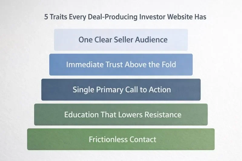
Every investor website that consistently produces deals follows the same underlying framework. Not because they copied each other, but because they’re solving the same seller problems in the same order.
This isn’t about features. It’s about alignment. When a website matches how a motivated seller thinks and feels in the moment, conversions happen naturally. When it doesn’t, nothing else matters.
One Clear Audience (Not “Everyone”)
The best investor websites speak to one specific seller problem, not the entire market.
They know exactly who they’re for. An inherited property that no one wants to deal with. A tired landlord burned out from tenants and repairs. A homeowner facing foreclosure stress who needs options, not pressure.
Generic messaging feels safe, but it quietly kills conversions.
When a seller lands on a site, they’re subconsciously asking one question. Is this meant for someone like me? If that answer isn’t obvious within the first few seconds, they leave. Not because they’re uninterested, but because uncertainty feels risky.
Deal-producing sites make the seller feel seen immediately. That clarity does more work than any clever headline ever could.
Immediate Trust Above the Fold
Trust has to be established before anything else happens.
What works here is surprisingly simple. Real photos instead of stock images. Clear language that explains who you are and what you do without hype. Local references that signal familiarity, not scale.
National branding and generic promises create distance. Local language creates comfort.
Most sellers arriving on an investor website are anxious. They’ve been burned before, or they’re worried about making the wrong move. If trust isn’t established instantly, no offer will matter later. The offer only works after safety is felt.
A Single Primary Call to Action
Deal-finding websites are focused. They don’t give visitors six different paths to choose from.
No cluttered menus. No competing buttons. No distractions pulling attention away from the next step.
The strongest sites center everything around one clear action. Get a cash offer. See if we can help. Talk to a local buyer. The wording varies, but the intent doesn’t.
Removing choice feels counterintuitive, but it works. When a seller is overwhelmed, fewer options feel safer. Clarity beats flexibility every time.
Education That Lowers Resistance
The highest-performing investor websites don’t try to sell. They explain.
They walk sellers through the process in plain language. What happens after the form is submitted. How long things typically take. What pressure looks like, and what it doesn’t.
This kind of education quietly reduces fear. It lowers skepticism. And it prevents ghosting later because expectations are set early.
When sellers understand what’s coming, they’re far more willing to start the conversation. Education isn’t filler. It’s friction removal.
Frictionless Contact
The goal of a deal-producing website isn’t qualification. It’s starting the conversation.
Short forms outperform long ones. Asking for only what’s necessary keeps momentum intact. Mobile-first design matters because many sellers are filling out forms on their phone, often late at night.
Every extra field is a reason to hesitate.
Once contact is made, everything else can be figured out later. The website’s job is simply to make raising a hand feel easy, safe, and low commitment. That’s how conversations start, and deals follow.
Examples of Real Estate Investor Websites That Actually Find Deals
This is where most “best of” articles fall apart. They list dozens of sites without explaining why any of them work.
You don’t need 20 examples. You need a few clear breakdowns that show patterns you can reuse. The goal here isn’t inspiration. It’s extraction.
Below are a handful of investor websites that consistently generate inbound seller leads, and more importantly, the strategic choices behind them.
A Local Cash Buyer Focused on Inherited Properties
Who it’s for
This type of site is built specifically for heirs dealing with an inherited house they don’t want to manage, clean out, or renovate.
Primary CTA
A simple cash-offer request or “see your options” form placed above the fold.
What they do better than average
They immediately acknowledge the emotional and logistical burden of inheritance. The copy speaks to timelines, probate confusion, and the desire for a clean exit without judgment.
Why it works psychologically
Inherited sellers often feel overwhelmed and guilty at the same time. This site lowers emotional friction by framing the sale as a solution, not a failure. It replaces urgency with relief.
What most investors can copy
Clear niche focus and language that names the problem directly instead of dancing around it.
A Website Built for Burned-Out Landlords
Who it’s for
Landlords dealing with late payments, property damage, rising costs, or tenant issues they no longer want to manage.
Primary CTA
“Talk to a local buyer” or “see if selling makes sense,” not “sell now.”
What they do better than average
They lead with empathy instead of numbers. The site outlines common landlord pain points before ever mentioning price, which signals understanding rather than extraction.
Why it works psychologically
Tired landlords aren’t desperate. They’re exhausted. By validating that feeling, the site earns trust before asking for action.
What most investors can copy
Problem-first messaging and CTAs that feel advisory instead of transactional.
A Distressed Seller Site Focused on Foreclosure Stress
Who it’s for
Homeowners facing foreclosure, missed payments, or looming deadlines.
Primary CTA
A low-pressure contact option framed as “explore options” rather than “get an offer.”
What they do better than average
The process is explained step by step. No jargon. No countdown timers. Clear statements about what happens after contact and what won’t happen.
Why it works psychologically
Fear shuts people down. Transparency reopens the door. By reducing uncertainty, the site makes taking action feel safer than doing nothing.
What most investors can copy
Education that lowers resistance and replaces urgency with clarity.
The Pattern Worth Noticing
None of these sites rely on flashy design. They don’t try to impress. They try to connect.
Each one speaks to a single seller type, removes confusion quickly, and makes the next step feel low risk. That’s the real takeaway. Deal-producing websites aren’t louder or smarter. They’re clearer.
If you can identify who your site is truly for and structure everything around that moment of hesitation, you’re already ahead of most investors.
Why These Websites Work When Others Don’t

The difference isn’t traffic, templates, or tools. It’s alignment.
When you strip away design preferences and marketing noise, the investor websites that consistently find deals are solving the same problem in the same way. They meet sellers emotionally first, structurally second, and tactically last. Everything else is decoration.
This section matters because it explains why the earlier examples work, and why most sites quietly fail even with decent traffic.
Deals don’t come from traffic. They come from trust.
They Optimize for Seller Emotions, Not Investor Ego
Most investor websites are written to impress other investors. Credentials. Volume. Scale. Big promises. None of that helps a stressed homeowner feel safe.
The sites that work flip the priority.
They assume the seller is anxious, skeptical, and tired. Messaging is calm. Language is human. The tone signals understanding rather than authority. That emotional alignment lowers defenses immediately.
Investor ego shows up as over-explaining success. Seller empathy shows up as naming the problem clearly. One repels. The other invites.
When a seller feels understood, they stay long enough for trust to form.
They Remove Confusion Before Asking for Action
Confusion is the silent conversion killer.
Deal-producing websites anticipate the questions sellers are afraid to ask. What happens next. Will I be pressured. How long does this take. Who am I actually dealing with.
They answer those questions early and plainly.
By reducing uncertainty, these sites make inaction feel riskier than action. That shift is subtle, but powerful. Sellers don’t move forward because they’re convinced. They move forward because the path feels clear.
Clarity creates momentum.
They Make the Next Step Obvious
High-performing investor websites don’t overwhelm visitors with options. They guide them.
There’s one primary action. It’s visible. It’s repeated. And it’s framed as a conversation, not a commitment.
When someone is already overwhelmed, simplicity feels like relief. Making the next step obvious removes decision fatigue and replaces it with progress.
Most sites fail here by trying to be flexible. The best ones succeed by being decisive.
They Rely on Clarity, Not Clever Copy
Clever copy sounds good. Clear copy gets results.
The websites that consistently find deals use simple language, short explanations, and straightforward promises. Nothing needs decoding. Nothing feels exaggerated.
Clarity builds credibility because it signals confidence. If you don’t need hype, you probably know what you’re doing.
That’s what sellers respond to. Not wordplay. Not buzzwords. Just the quiet assurance that someone understands their situation and can help.
Trust follows clarity. Conversations follow trust. Deals follow conversations.
What Most Investors Get Wrong When Building Their Website

Most investor websites don’t fail because the owners lack effort or intelligence. They fail because they’re built from the wrong perspective.
Instead of asking how a stressed seller experiences the site, investors build for how they want to be perceived. The result is a disconnect that quietly kills conversions long before an offer is ever discussed.
These mistakes show up again and again.
Copying Hedge-Fund Aesthetics
Sleek, corporate design feels safe to investors. To sellers, it feels distant.
When a website looks like it was designed for institutions instead of people, it raises subconscious red flags. Homeowners dealing with real problems aren’t looking for sophistication. They’re looking for reassurance.
Polished visuals without warmth create emotional distance. Local, imperfect, human signals close it.
The goal isn’t to look impressive. It’s to look approachable.
Talking About Themselves Too Much
Many investor websites lead with bios, achievements, and experience. That information has a place, but it rarely belongs first.
Sellers don’t arrive wondering who you are. They arrive wondering if you can help them. When a site centers the investor instead of the problem, it forces the visitor to work harder to connect the dots.
The best sites flip this order. They address the seller’s situation first, then introduce themselves as the solution.
Relevance always beats credentials.
Over-Explaining Credentials
Experience matters, but over-explaining it creates friction.
Long lists of certifications, years in business, or deal counts often read like compensation, not confidence. Sellers don’t need to be convinced you’re impressive. They need to feel you’re trustworthy.
A few clear signals do more than a wall of proof. When trust is established emotionally, credentials reinforce it. When trust isn’t there yet, credentials feel like noise.
Less explanation. More assurance.
Hiding the Call to Action
Some investor websites bury the next step deep in menus or scattered buttons. Others are so cautious they barely ask for action at all.
This creates uncertainty. If the seller isn’t sure what to do next, they do nothing.
Clear CTAs don’t feel pushy when they’re aligned with the problem. They feel helpful. The strongest sites repeat the next step consistently and visibly without pressure.
Silence is not politeness. It’s confusion.
Trying to Look Big Instead of Local and Human
Scale is often mistaken for trust.
Investors try to look national, established, or “bigger than life” because they think it signals credibility. For many sellers, it does the opposite. It makes them feel like a number.
Local language, real faces, and simple explanations create connection. Sellers want to know there’s a real person on the other side who understands their market and their situation.
Deals don’t come from looking big. They come from feeling close.
How to Model These Sites Without Copying Them
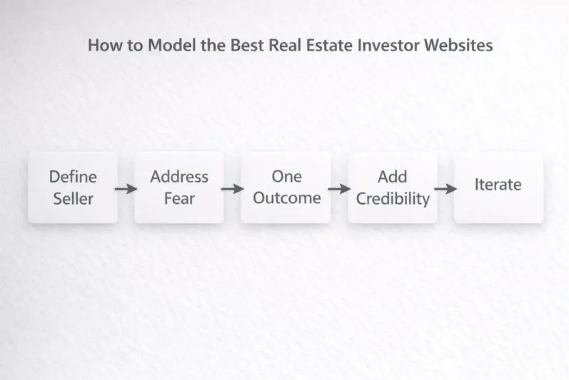
The goal isn’t to clone another investor’s website. It’s to understand the structure underneath it and apply the same logic to your own market and seller type.
When you copy layouts or headlines without understanding why they work, you inherit someone else’s assumptions. When you model the framework, you build something that fits your situation and still converts.
Here’s a simple way to do that.
Step 1: Define Your Seller Avatar
Everything starts here.
If you try to speak to every seller, you end up connecting with none. You need to be specific about who your site is for and what problem brought them there.
Is it an inherited property with probate confusion. A landlord dealing with rising costs and tenant issues. A homeowner behind on payments and running out of time.
When you define this clearly, your messaging becomes easier to write and easier to read. Sellers recognize themselves immediately, which keeps them on the page.
Clarity at this stage saves months of rework later.
Step 2: Write Copy That Answers Their First Fear
Every seller arrives with a primary fear. Being pressured. Being taken advantage of. Making the wrong decision.
Your job is to answer that fear before you explain anything else.
This doesn’t require long copy. It requires directness. Simple statements that explain what you do, what you don’t do, and what the process actually looks like.
When fear is addressed early, trust has room to grow. If it’s ignored, nothing else matters.
Step 3: Strip the Site Down to One Outcome
High-performing investor websites are intentionally narrow.
One primary action. One clear path. One outcome the site is designed to produce.
Every extra menu item, button, or sidebar competes with that goal. When you remove distractions, momentum increases.
This isn’t about limiting options forever. It’s about guiding the first step. Once the conversation starts, flexibility can exist off the website.
Step 4: Add Credibility After Clarity
Credibility works best after the seller understands what’s happening.
Once the problem is named and the process is clear, testimonials, experience, and local proof reinforce trust instead of replacing it.
Think of credibility as confirmation, not persuasion. It answers the question, “Can I trust you?” after the seller already knows what you do.
Order matters more than volume here.
Step 5: Test and Iterate
No website gets it perfect on day one.
The best investor sites evolve by paying attention to behavior. Where people drop off. Which pages hold attention. Which CTAs get ignored.
Small changes compound. Headline tweaks. Form length adjustments. Clearer explanations.
Iteration isn’t a failure signal. It’s how clarity improves over time.
Deal Flow Isn’t About Tools, It’s About Systems

A real estate investor website by itself doesn’t find deals. It never has.
Websites don’t negotiate, follow up, or close. They sit there. Their value comes from how they fit into a larger, repeatable system that runs every week whether you feel motivated or not.
This distinction matters because many investors treat their website like a one-time project. Build it, launch it, and wait. When nothing happens, they assume the tool failed instead of recognizing the system was incomplete.
A Website Is Only One Piece of the Machine
Deal-producing investors don’t rely on a website in isolation.
The site supports outreach, follow-up, local visibility, and trust-building across multiple touchpoints. It’s where conversations begin, not where the entire process lives.
When someone hears about you through a referral, a Google search, or a piece of content, the website becomes the confirmation step. It validates that you’re real, local, and credible before a call ever happens.
Without a system feeding it attention and context, even a well-built site underperforms.
Repeatable Systems Beat One-Off Effort

The investors who consistently find deals don’t chase tactics. They run routines.
Weekly check-ins on traffic and form submissions. Regular content that answers common seller questions. Simple follow-up workflows that turn inquiries into conversations.
The website becomes predictable because the system around it is predictable. That consistency compounds trust over time.
This is why two investors can use similar tools and get wildly different results. One is running a system. The other is hoping.
Treat Your Website Like a Conversion Asset
The strongest investors don’t treat their site like a brochure.
Brochures explain. Conversion assets guide behavior.
A conversion-focused website is measured by conversations started, not pages published. Every section exists to reduce friction, answer objections, and move someone closer to contact.
When you view your website through that lens, decisions become simpler. What stays. What goes. What gets tested.
Tools change. Systems endure.